Onboarding flow
Steadily onboarding
A calm three-screen onboarding journey that helps users choose a sustainable routine and begin.
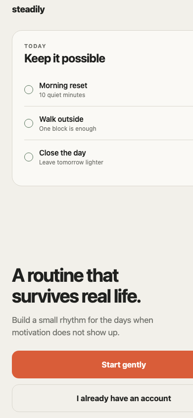
Resource ID · installer coming next
flow/steadily-onboardingsrc/mobileblocks/flows/steadily-onboarding/onboarding-flow.tsx
import { useState } from 'react';

import { ReadyScreen } from './screens/ready-screen';
import { RhythmScreen, type Rhythm } from './screens/rhythm-screen';
import { WelcomeScreen } from './screens/welcome-screen';

export type OnboardingStep = 0 | 1 | 2;

export interface OnboardingFlowProps {
  colorMode?: 'light' | 'dark' | 'system';
  initialStep?: OnboardingStep;
  onComplete?: (rhythm: Rhythm) => void;
  onSignIn?: () => void;
}

export function OnboardingFlow({
  colorMode = 'system',
  initialStep = 0,
  onComplete,
  onSignIn,
}: OnboardingFlowProps) {
  const [step, setStep] = useState<OnboardingStep>(initialStep);
  const [rhythm, setRhythm] = useState<Rhythm>('balanced');

  if (step === 0) {
    return (
      <WelcomeScreen
        colorMode={colorMode}
        onContinue={() => setStep(1)}
        onSignIn={onSignIn}
      />
    );
  }

  if (step === 1) {
    return (
      <RhythmScreen
        colorMode={colorMode}
        onBack={() => setStep(0)}
        onChange={setRhythm}
        onContinue={() => setStep(2)}
        value={rhythm}
      />
    );
  }

  return (
    <ReadyScreen
      colorMode={colorMode}
      onBack={() => setStep(1)}
      onComplete={() => onComplete?.(rhythm)}
      rhythm={rhythm}
    />
  );
}
src/mobileblocks/flows/steadily-onboarding/screens/welcome-screen.tsx
import { useMemo } from 'react';
import { StyleSheet, Text, useColorScheme, View } from 'react-native';
import { SafeAreaView } from 'react-native-safe-area-context';

import { Button } from '../../../components/button';
import { palette, radius, space } from '../../../foundation/tokens';

export interface WelcomeScreenProps {
  colorMode?: 'light' | 'dark' | 'system';
  onContinue?: () => void;
  onSignIn?: () => void;
}

const rituals = [
  { time: '07:30', title: 'Morning reset', detail: '10 quiet minutes' },
  { time: '12:00', title: 'Walk outside', detail: 'One block is enough' },
  { time: '21:45', title: 'Close the day', detail: 'Leave tomorrow lighter' },
];

export function WelcomeScreen({ colorMode = 'system', onContinue, onSignIn }: WelcomeScreenProps) {
  const systemColorScheme = useColorScheme();
  const isDark = colorMode === 'dark' || (colorMode === 'system' && systemColorScheme === 'dark');
  const theme = useMemo(
    () =>
      isDark
        ? {
            canvas: palette.dark.canvas,
            surface: palette.dark.surface,
            ink: palette.dark.ink,
            muted: palette.dark.inkMuted,
            line: palette.dark.line,
            success: palette.dark.success,
          }
        : {
            canvas: palette.canvas,
            surface: palette.surface,
            ink: palette.ink,
            muted: palette.inkMuted,
            line: palette.line,
            success: palette.success,
          },
    [isDark],
  );

  return (
    <View style={[styles.root, { backgroundColor: theme.canvas }]}>
      <SafeAreaView style={styles.safeArea} edges={['top', 'bottom']}>
        <View style={styles.header}>
          <Text style={[styles.wordmark, { color: theme.ink }]}>steadily</Text>
          <Text style={[styles.step, { color: theme.muted }]}>1 of 3</Text>
        </View>

        <View style={[styles.preview, { backgroundColor: theme.surface, borderColor: theme.line }]}>
          <View style={styles.previewHeading}>
            <View>
              <Text style={[styles.previewEyebrow, { color: theme.muted }]}>TODAY</Text>
              <Text style={[styles.previewTitle, { color: theme.ink }]}>Keep it possible</Text>
            </View>
            <View style={[styles.count, { borderColor: theme.line }]}>
              <Text style={[styles.countText, { color: theme.ink }]}>3</Text>
            </View>
          </View>

          <View style={styles.ritualList}>
            {rituals.map((ritual, index) => (
              <View
                key={ritual.time}
                style={[
                  styles.ritual,
                  index < rituals.length - 1 && { borderBottomColor: theme.line, borderBottomWidth: 1 },
                ]}
              >
                <View style={[styles.check, { borderColor: theme.success }]} />
                <View style={styles.ritualCopy}>
                  <Text style={[styles.ritualTitle, { color: theme.ink }]}>{ritual.title}</Text>
                  <Text style={[styles.ritualDetail, { color: theme.muted }]}>{ritual.detail}</Text>
                </View>
                <Text style={[styles.ritualTime, { color: theme.muted }]}>{ritual.time}</Text>
              </View>
            ))}
          </View>
        </View>

        <View style={styles.copy}>
          <Text style={[styles.title, { color: theme.ink }]}>A routine that survives real life.</Text>
          <Text style={[styles.body, { color: theme.muted }]}>
            Build a small rhythm for the days when motivation does not show up.
          </Text>
        </View>

        <View style={styles.actions}>
          <Button colorMode={colorMode} onPress={onContinue}>Start gently</Button>
          <Button colorMode={colorMode} tone="secondary" onPress={onSignIn}>
            I already have an account
          </Button>
        </View>
      </SafeAreaView>
    </View>
  );
}

const styles = StyleSheet.create({
  root: { flex: 1 },
  safeArea: { flex: 1, paddingHorizontal: space.xl, paddingTop: space.sm, paddingBottom: space.md },
  header: { flexDirection: 'row', justifyContent: 'space-between', alignItems: 'center' },
  wordmark: { fontSize: 18, fontWeight: '800', letterSpacing: -0.5 },
  step: { fontSize: 13, fontWeight: '600' },
  preview: { marginTop: space.xxl, borderWidth: 1, borderRadius: radius.card, padding: space.xl },
  previewHeading: { flexDirection: 'row', alignItems: 'center', justifyContent: 'space-between' },
  previewEyebrow: { fontSize: 11, fontWeight: '700', letterSpacing: 1.2 },
  previewTitle: { marginTop: space.xs, fontSize: 24, fontWeight: '700', letterSpacing: -0.8 },
  count: { width: 40, height: 40, borderWidth: 1, borderRadius: radius.pill, alignItems: 'center', justifyContent: 'center' },
  countText: { fontSize: 15, fontWeight: '700' },
  ritualList: { marginTop: space.lg },
  ritual: { minHeight: 68, flexDirection: 'row', alignItems: 'center' },
  check: { width: 18, height: 18, borderWidth: 1.5, borderRadius: radius.pill },
  ritualCopy: { flex: 1, marginLeft: space.md },
  ritualTitle: { fontSize: 15, fontWeight: '600', letterSpacing: -0.2 },
  ritualDetail: { marginTop: 3, fontSize: 12 },
  ritualTime: { fontSize: 12, fontVariant: ['tabular-nums'] },
  copy: { flex: 1, justifyContent: 'flex-end', paddingTop: space.xxl, paddingBottom: space.xl },
  title: { maxWidth: 330, fontSize: 38, lineHeight: 42, fontWeight: '700', letterSpacing: -1.7 },
  body: { maxWidth: 330, marginTop: space.lg, fontSize: 17, lineHeight: 25, letterSpacing: -0.2 },
  actions: { gap: space.md },
});
src/mobileblocks/flows/steadily-onboarding/screens/rhythm-screen.tsx
import { useMemo } from 'react';
import { Pressable, StyleSheet, Text, useColorScheme, View } from 'react-native';
import { SafeAreaView } from 'react-native-safe-area-context';

import { Button } from '../../../components/button';
import { palette, radius, space } from '../../../foundation/tokens';

export type Rhythm = 'gentle' | 'balanced' | 'focused';

export interface RhythmScreenProps {
  colorMode?: 'light' | 'dark' | 'system';
  onBack?: () => void;
  onChange?: (value: Rhythm) => void;
  onContinue?: () => void;
  value: Rhythm;
}

const choices: Array<{ value: Rhythm; title: string; detail: string }> = [
  { value: 'gentle', title: 'Gentle', detail: 'One small ritual at a time' },
  { value: 'balanced', title: 'Balanced', detail: 'A little structure, room to adapt' },
  { value: 'focused', title: 'Focused', detail: 'Clear targets and a stronger pace' },
];

export function RhythmScreen({
  colorMode = 'system',
  onBack,
  onChange,
  onContinue,
  value,
}: RhythmScreenProps) {
  const systemColorScheme = useColorScheme();
  const isDark = colorMode === 'dark' || (colorMode === 'system' && systemColorScheme === 'dark');
  const theme = useMemo(() => (isDark ? palette.dark : palette), [isDark]);

  return (
    <View style={[styles.root, { backgroundColor: theme.canvas }]}>
      <SafeAreaView style={styles.safeArea} edges={['top', 'bottom']}>
        <View style={styles.header}>
          <Pressable accessibilityRole="button" hitSlop={12} onPress={onBack}>
            <Text style={[styles.back, { color: theme.ink }]}>Back</Text>
          </Pressable>
          <Text style={[styles.step, { color: theme.inkMuted }]}>2 of 3</Text>
        </View>

        <View style={styles.copy}>
          <Text style={[styles.eyebrow, { color: theme.inkMuted }]}>YOUR RHYTHM</Text>
          <Text style={[styles.title, { color: theme.ink }]}>How should this feel?</Text>
          <Text style={[styles.body, { color: theme.inkMuted }]}>Choose a starting pace. You can change it whenever life does.</Text>
        </View>

        <View accessibilityRole="radiogroup" style={styles.choices}>
          {choices.map((choice) => {
            const selected = value === choice.value;
            return (
              <Pressable
                accessibilityRole="radio"
                accessibilityState={{ checked: selected }}
                key={choice.value}
                onPress={() => onChange?.(choice.value)}
                style={({ pressed }) => [
                  styles.choice,
                  { backgroundColor: theme.surface, borderColor: selected ? theme.accent : theme.line },
                  pressed && styles.pressed,
                ]}
              >
                <View style={[styles.radio, { borderColor: selected ? theme.accent : theme.line }]}>
                  {selected && <View style={[styles.radioDot, { backgroundColor: theme.accent }]} />}
                </View>
                <View style={styles.choiceCopy}>
                  <Text style={[styles.choiceTitle, { color: theme.ink }]}>{choice.title}</Text>
                  <Text style={[styles.choiceDetail, { color: theme.inkMuted }]}>{choice.detail}</Text>
                </View>
              </Pressable>
            );
          })}
        </View>

        <View style={styles.footer}>
          <Button colorMode={colorMode} onPress={onContinue}>Continue</Button>
        </View>
      </SafeAreaView>
    </View>
  );
}

const styles = StyleSheet.create({
  root: { flex: 1 },
  safeArea: { flex: 1, paddingHorizontal: space.xl, paddingTop: space.sm, paddingBottom: space.md },
  header: { flexDirection: 'row', justifyContent: 'space-between', alignItems: 'center' },
  back: { fontSize: 15, fontWeight: '700' },
  step: { fontSize: 13, fontWeight: '600' },
  copy: { marginTop: space.jumbo },
  eyebrow: { fontSize: 11, fontWeight: '800', letterSpacing: 1.2 },
  title: { marginTop: space.md, fontSize: 38, lineHeight: 42, fontWeight: '700', letterSpacing: -1.7 },
  body: { marginTop: space.lg, maxWidth: 330, fontSize: 17, lineHeight: 25 },
  choices: { marginTop: space.xxl, gap: space.md },
  choice: { minHeight: 84, flexDirection: 'row', alignItems: 'center', borderWidth: 1.5, borderRadius: radius.card, padding: space.lg },
  pressed: { opacity: 0.8 },
  radio: { width: 22, height: 22, borderWidth: 1.5, borderRadius: radius.pill, alignItems: 'center', justifyContent: 'center' },
  radioDot: { width: 10, height: 10, borderRadius: radius.pill },
  choiceCopy: { marginLeft: space.lg },
  choiceTitle: { fontSize: 16, fontWeight: '700' },
  choiceDetail: { marginTop: space.xs, fontSize: 13 },
  footer: { flex: 1, justifyContent: 'flex-end' },
});
src/mobileblocks/flows/steadily-onboarding/screens/ready-screen.tsx
import { useMemo } from 'react';
import { Pressable, StyleSheet, Text, useColorScheme, View } from 'react-native';
import { SafeAreaView } from 'react-native-safe-area-context';

import { Button } from '../../../components/button';
import { palette, radius, space } from '../../../foundation/tokens';
import type { Rhythm } from './rhythm-screen';

export interface ReadyScreenProps {
  colorMode?: 'light' | 'dark' | 'system';
  onBack?: () => void;
  onComplete?: () => void;
  rhythm: Rhythm;
}

const rhythmCopy: Record<Rhythm, string> = {
  gentle: 'One small ritual, repeated kindly.',
  balanced: 'Enough structure to help, enough room to adapt.',
  focused: 'Clear intentions and a stronger daily pace.',
};

export function ReadyScreen({ colorMode = 'system', onBack, onComplete, rhythm }: ReadyScreenProps) {
  const systemColorScheme = useColorScheme();
  const isDark = colorMode === 'dark' || (colorMode === 'system' && systemColorScheme === 'dark');
  const theme = useMemo(() => (isDark ? palette.dark : palette), [isDark]);

  return (
    <View style={[styles.root, { backgroundColor: theme.canvas }]}>
      <SafeAreaView style={styles.safeArea} edges={['top', 'bottom']}>
        <View style={styles.header}>
          <Pressable accessibilityRole="button" hitSlop={12} onPress={onBack}>
            <Text style={[styles.back, { color: theme.ink }]}>Back</Text>
          </Pressable>
          <Text style={[styles.step, { color: theme.inkMuted }]}>3 of 3</Text>
        </View>

        <View style={styles.center}>
          <View style={[styles.mark, { backgroundColor: theme.success }]}>
            <Text style={[styles.markText, { color: theme.canvas }]}>✓</Text>
          </View>
          <Text style={[styles.title, { color: theme.ink }]}>Your pace is enough.</Text>
          <Text style={[styles.body, { color: theme.inkMuted }]}>{rhythmCopy[rhythm]}</Text>
          <View style={[styles.summary, { backgroundColor: theme.surface, borderColor: theme.line }]}>
            <Text style={[styles.summaryLabel, { color: theme.inkMuted }]}>STARTING RHYTHM</Text>
            <Text style={[styles.summaryValue, { color: theme.ink }]}>{rhythm}</Text>
          </View>
        </View>

        <Button colorMode={colorMode} onPress={onComplete}>Build my first ritual</Button>
      </SafeAreaView>
    </View>
  );
}

const styles = StyleSheet.create({
  root: { flex: 1 },
  safeArea: { flex: 1, paddingHorizontal: space.xl, paddingTop: space.sm, paddingBottom: space.md },
  header: { flexDirection: 'row', justifyContent: 'space-between', alignItems: 'center' },
  back: { fontSize: 15, fontWeight: '700' },
  step: { fontSize: 13, fontWeight: '600' },
  center: { flex: 1, alignItems: 'center', justifyContent: 'center' },
  mark: { width: 72, height: 72, borderRadius: radius.pill, alignItems: 'center', justifyContent: 'center' },
  markText: { fontSize: 30, fontWeight: '800' },
  title: { marginTop: space.xxl, maxWidth: 320, textAlign: 'center', fontSize: 38, lineHeight: 42, fontWeight: '700', letterSpacing: -1.7 },
  body: { marginTop: space.lg, maxWidth: 310, textAlign: 'center', fontSize: 17, lineHeight: 25 },
  summary: { width: '100%', marginTop: space.xxl, borderWidth: 1, borderRadius: radius.card, padding: space.xl },
  summaryLabel: { fontSize: 11, fontWeight: '800', letterSpacing: 1.2 },
  summaryValue: { marginTop: space.sm, fontSize: 20, fontWeight: '700', textTransform: 'capitalize' },
});
src/mobileblocks/components/button.tsx
import type { ReactNode } from 'react';
import {
  ActivityIndicator,
  Pressable,
  StyleSheet,
  Text,
  useColorScheme,
  type PressableProps,
  type TextStyle,
  type ViewStyle,
} from 'react-native';

import { palette, radius, space } from '../foundation/tokens';

type ButtonTone = 'primary' | 'secondary';

export interface ButtonProps extends Omit<PressableProps, 'children' | 'style'> {
  children: ReactNode;
  colorMode?: 'light' | 'dark' | 'system';
  loading?: boolean;
  tone?: ButtonTone;
}

export function Button({
  children,
  colorMode = 'system',
  disabled = false,
  loading = false,
  tone = 'primary',
  accessibilityLabel,
  ...pressableProps
}: ButtonProps) {
  const systemColorScheme = useColorScheme();
  const isDark = colorMode === 'dark' || (colorMode === 'system' && systemColorScheme === 'dark');
  const activePalette = isDark ? palette.dark : palette;
  const toneStyles: Record<
    ButtonTone,
    { container: ViewStyle; pressed: ViewStyle; label: TextStyle; spinner: string }
  > = {
    primary: {
      container: { backgroundColor: activePalette.accent },
      pressed: { backgroundColor: activePalette.accentPressed },
      label: { color: activePalette.accentText },
      spinner: activePalette.accentText,
    },
    secondary: {
      container: { backgroundColor: 'transparent', borderColor: activePalette.line, borderWidth: 1 },
      pressed: { backgroundColor: activePalette.surface },
      label: { color: activePalette.ink },
      spinner: activePalette.ink,
    },
  };
  const selectedTone = toneStyles[tone];
  const isDisabled = disabled || loading;

  return (
    <Pressable
      accessibilityLabel={accessibilityLabel ?? (typeof children === 'string' ? children : undefined)}
      accessibilityRole="button"
      accessibilityState={{ busy: loading, disabled: isDisabled }}
      disabled={isDisabled}
      hitSlop={4}
      style={({ pressed }) => [
        styles.container,
        selectedTone.container,
        pressed && selectedTone.pressed,
        pressed && styles.pressed,
        isDisabled && styles.disabled,
      ]}
      {...pressableProps}
    >
      {loading ? (
        <ActivityIndicator color={selectedTone.spinner} />
      ) : (
        <Text style={[styles.label, selectedTone.label]}>{children}</Text>
      )}
    </Pressable>
  );
}

const styles = StyleSheet.create({
  container: {
    minHeight: 56,
    alignItems: 'center',
    justifyContent: 'center',
    borderRadius: radius.control,
    paddingHorizontal: space.xl,
  },
  label: {
    fontSize: 16,
    fontWeight: '700',
    letterSpacing: -0.2,
  },
  pressed: {
    transform: [{ scale: 0.985 }],
  },
  disabled: {
    opacity: 0.48,
  },
});
src/mobileblocks/foundation/tokens.ts
export const palette = {
  ink: '#20211F',
  inkMuted: '#6F706A',
  canvas: '#F2F0EA',
  surface: '#FAF9F5',
  line: '#DAD7CE',
  accent: '#D95D39',
  accentPressed: '#BF4D2D',
  accentText: '#FFF9F5',
  success: '#56745B',
  dark: {
    ink: '#F4F1E8',
    inkMuted: '#ABA99F',
    canvas: '#171816',
    surface: '#22231F',
    line: '#393A34',
    accent: '#E87350',
    accentPressed: '#CE6040',
    accentText: '#1B130F',
    success: '#8AAD90',
  },
} as const;

export const space = {
  xs: 4,
  sm: 8,
  md: 12,
  lg: 16,
  xl: 24,
  xxl: 32,
  jumbo: 48,
} as const;

export const radius = {
  control: 14,
  card: 20,
  pill: 999,
} as const;
src/mobileblocks/flows/steadily-onboarding/README.md
# Steadily onboarding

A three-Screen Expo onboarding Flow that introduces a habit product, lets the user choose a starting rhythm, and emits the final choice through `onComplete`.

## Use

Render `OnboardingFlow` inside any Screen or route. The Flow owns only temporary step selection; the consuming app owns navigation, authentication, analytics, and persistence.

```tsx
<OnboardingFlow
  onComplete={(rhythm) => saveOnboardingChoice(rhythm)}
  onSignIn={() => router.push('/sign-in')}
/>
```

Use `initialStep` for deterministic previews or to restore progress from application-owned storage.
src/mobileblocks/flows/steadily-onboarding/AGENTS.md
# Steadily onboarding agent guide

- Use this Flow for a three-step first-run journey, not as a general carousel.
- Supply persistence, analytics, authentication, and app navigation through the callbacks in `OnboardingFlowProps`.
- Keep `Rhythm` values stable if stored data already uses them.
- Product copy, colors, spacing, and ritual examples are safe customization points.
- Preserve safe-area handling, accessibility roles and states, minimum touch sizes, light/dark behavior, and the typed completion result.
- Do not add network requests, storage access, or Expo Router imports to the core Flow. Add an application-owned adapter instead.